2022 Branding,Packaging moody
Year Category Client
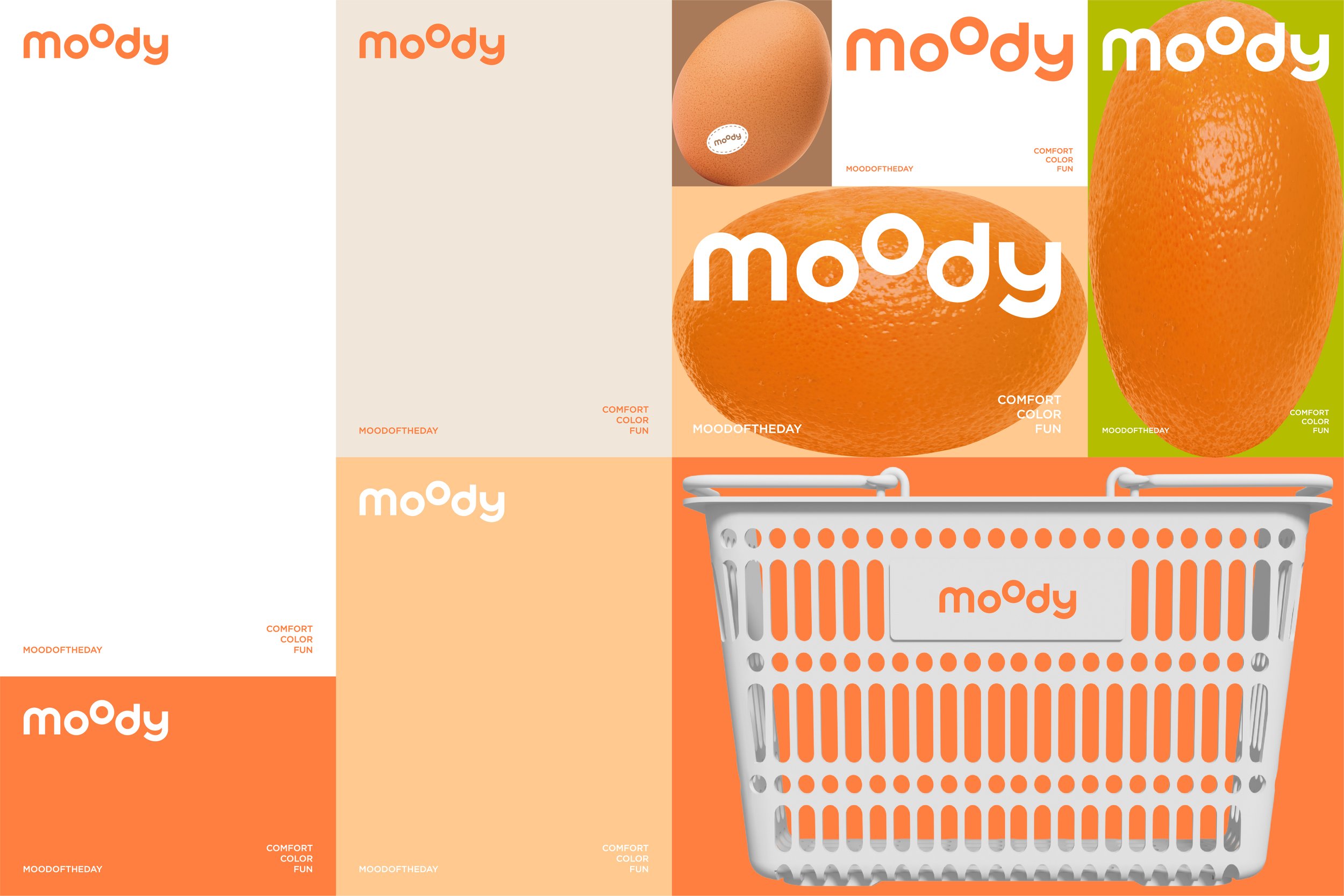
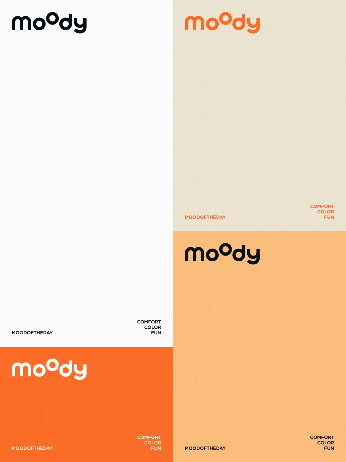
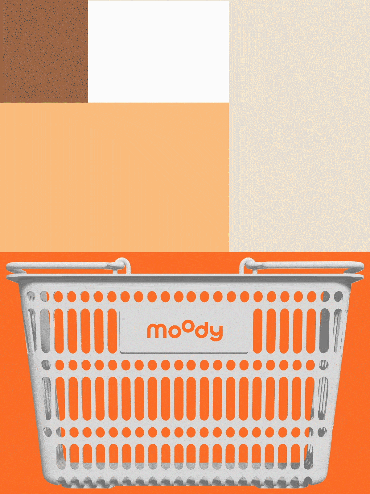
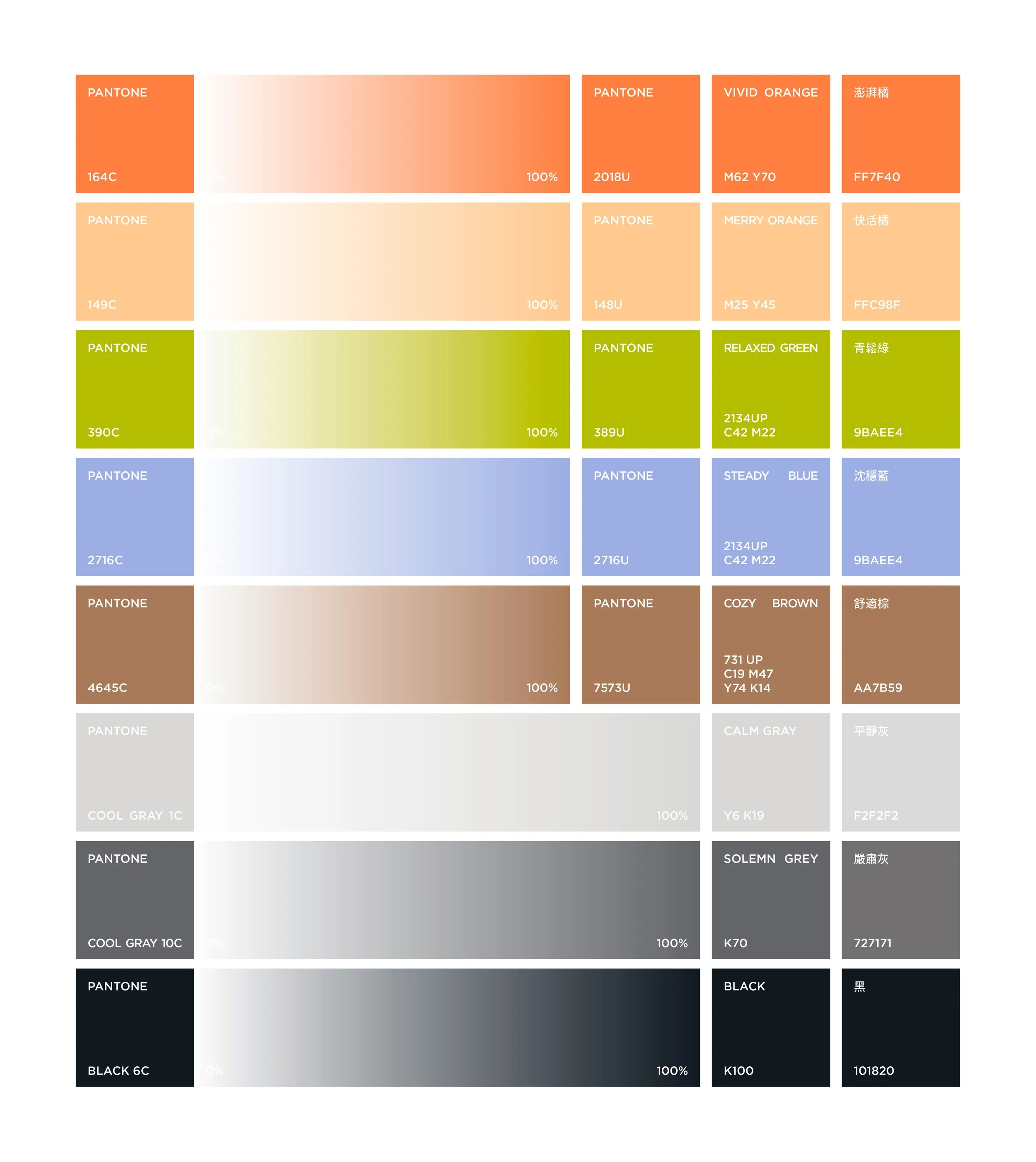
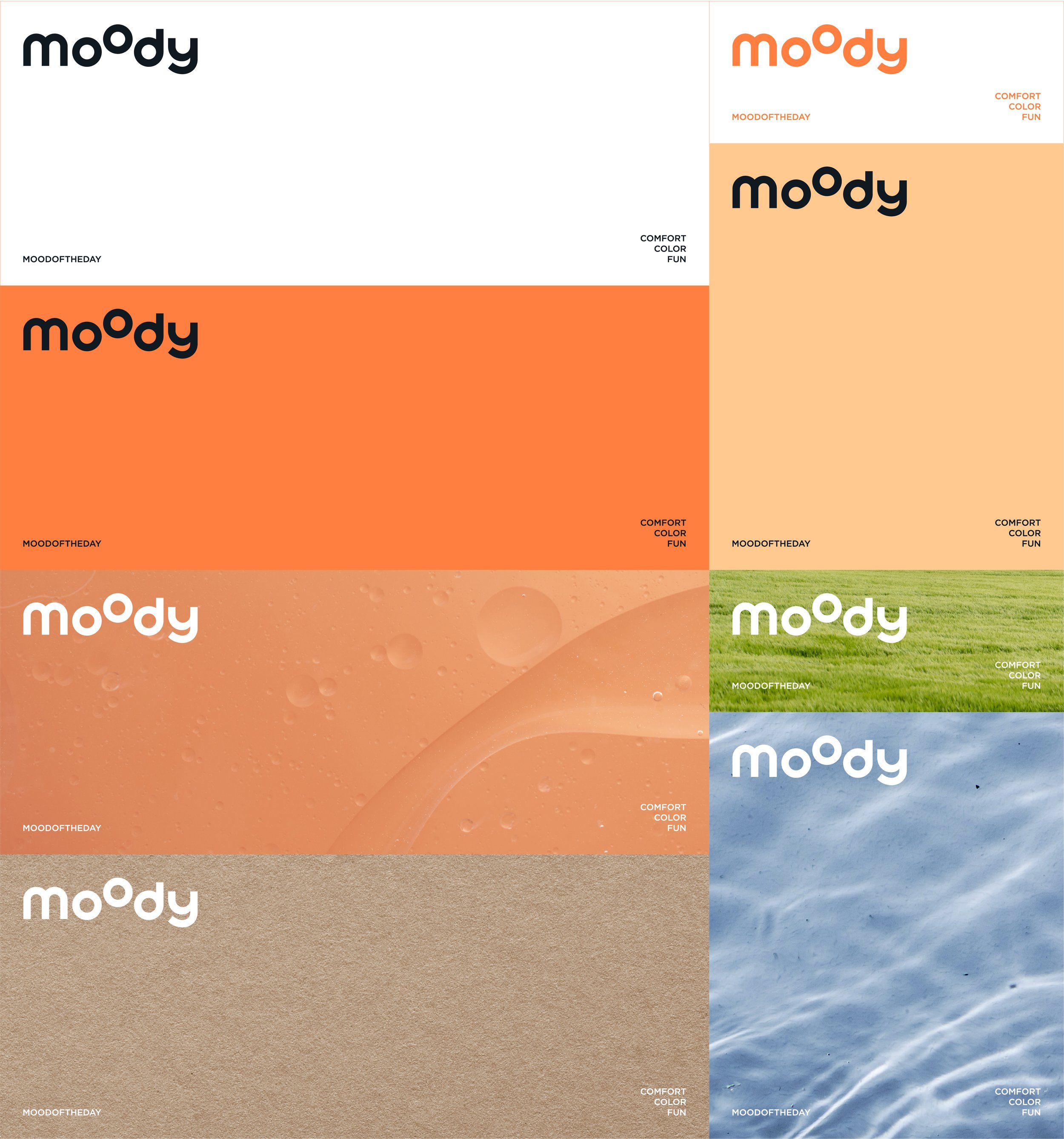
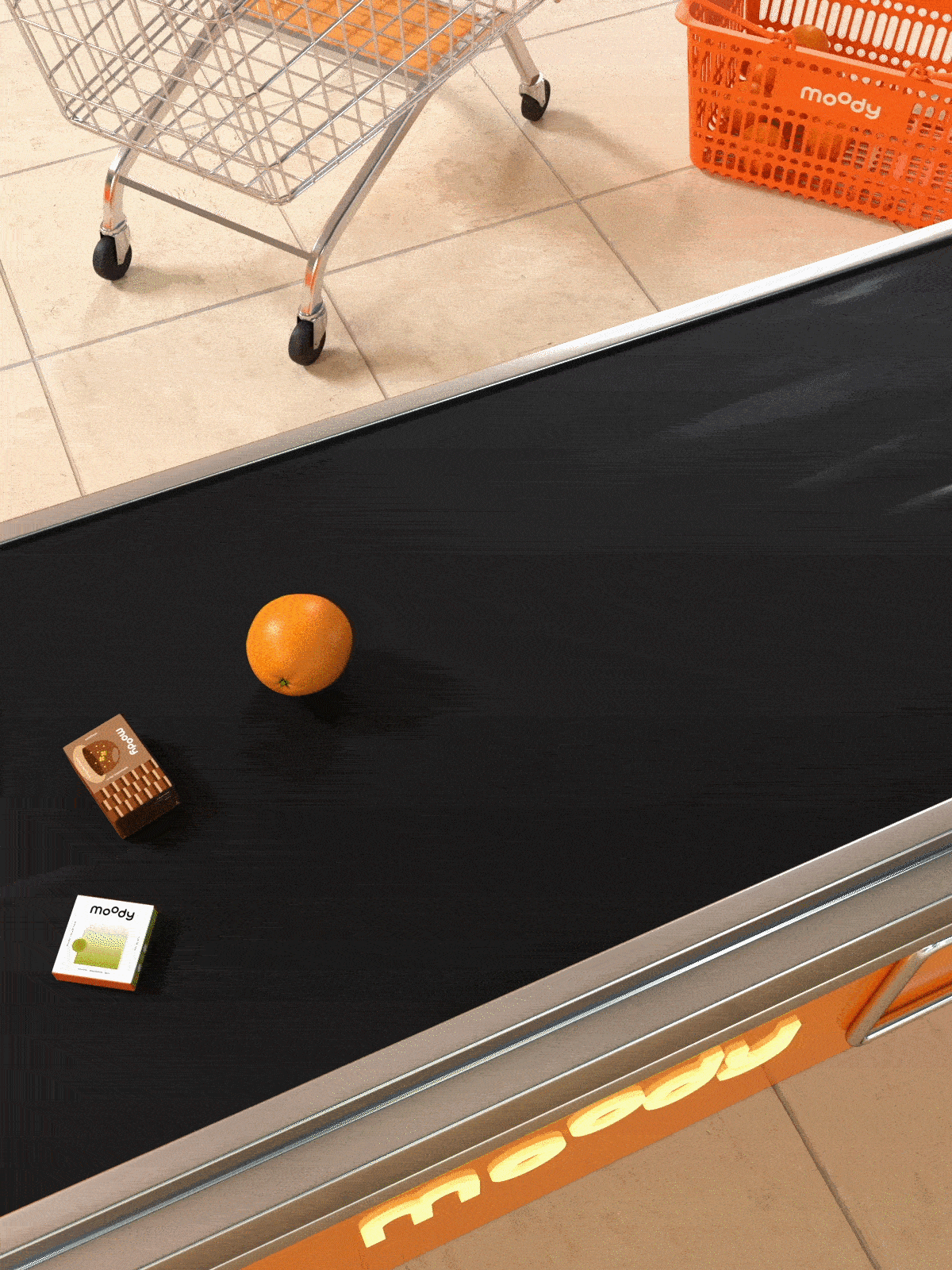
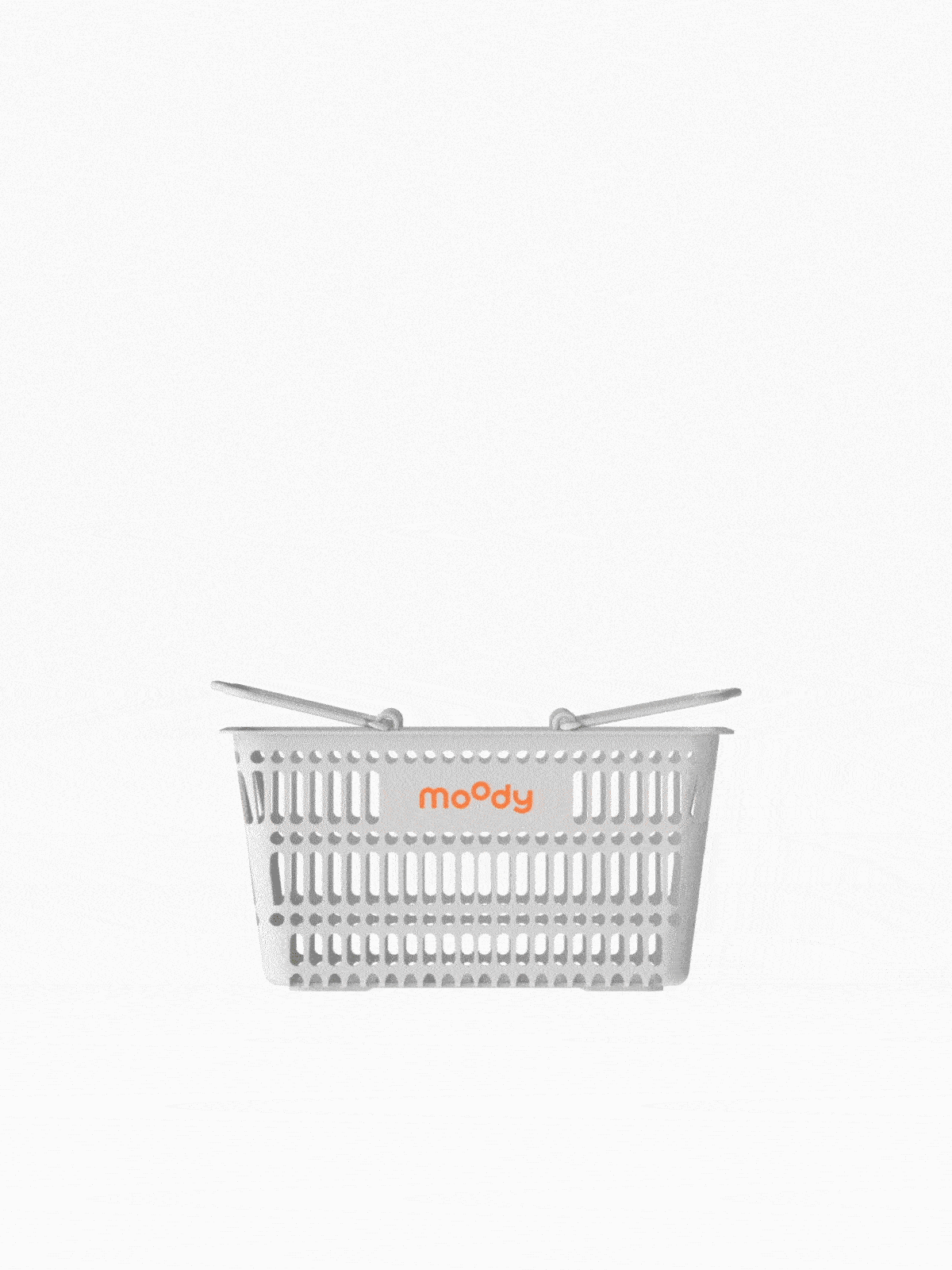
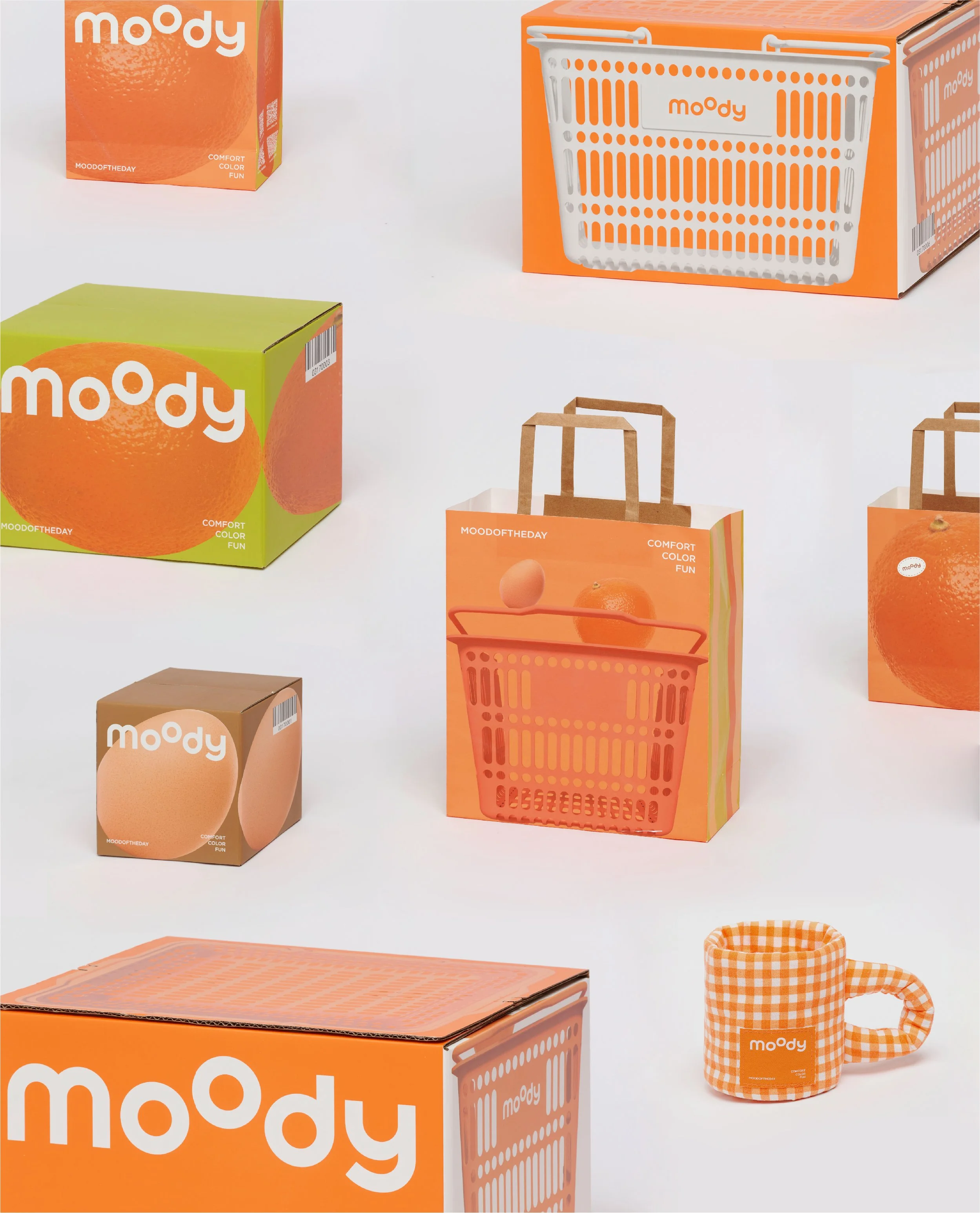
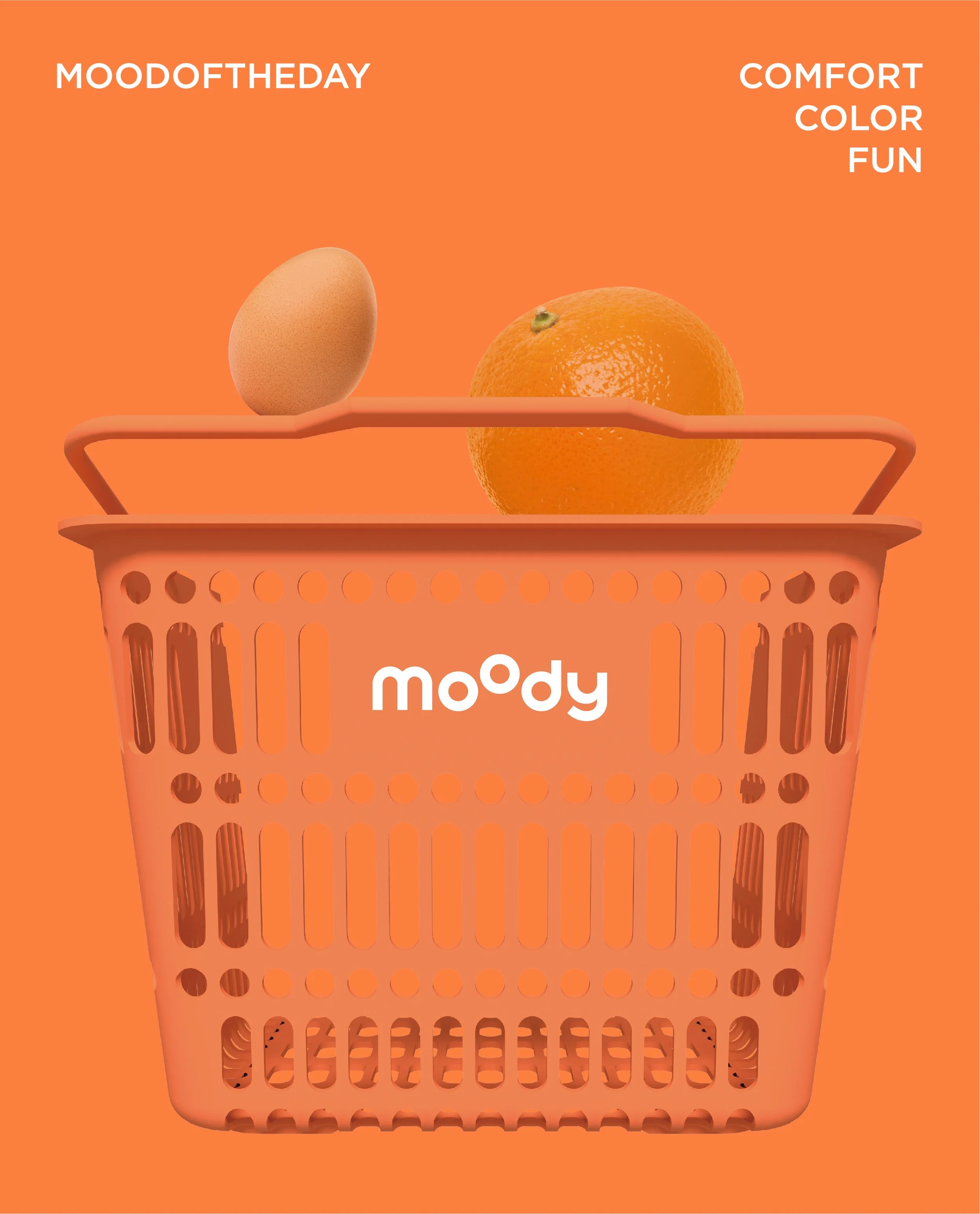
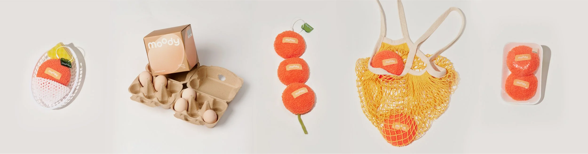
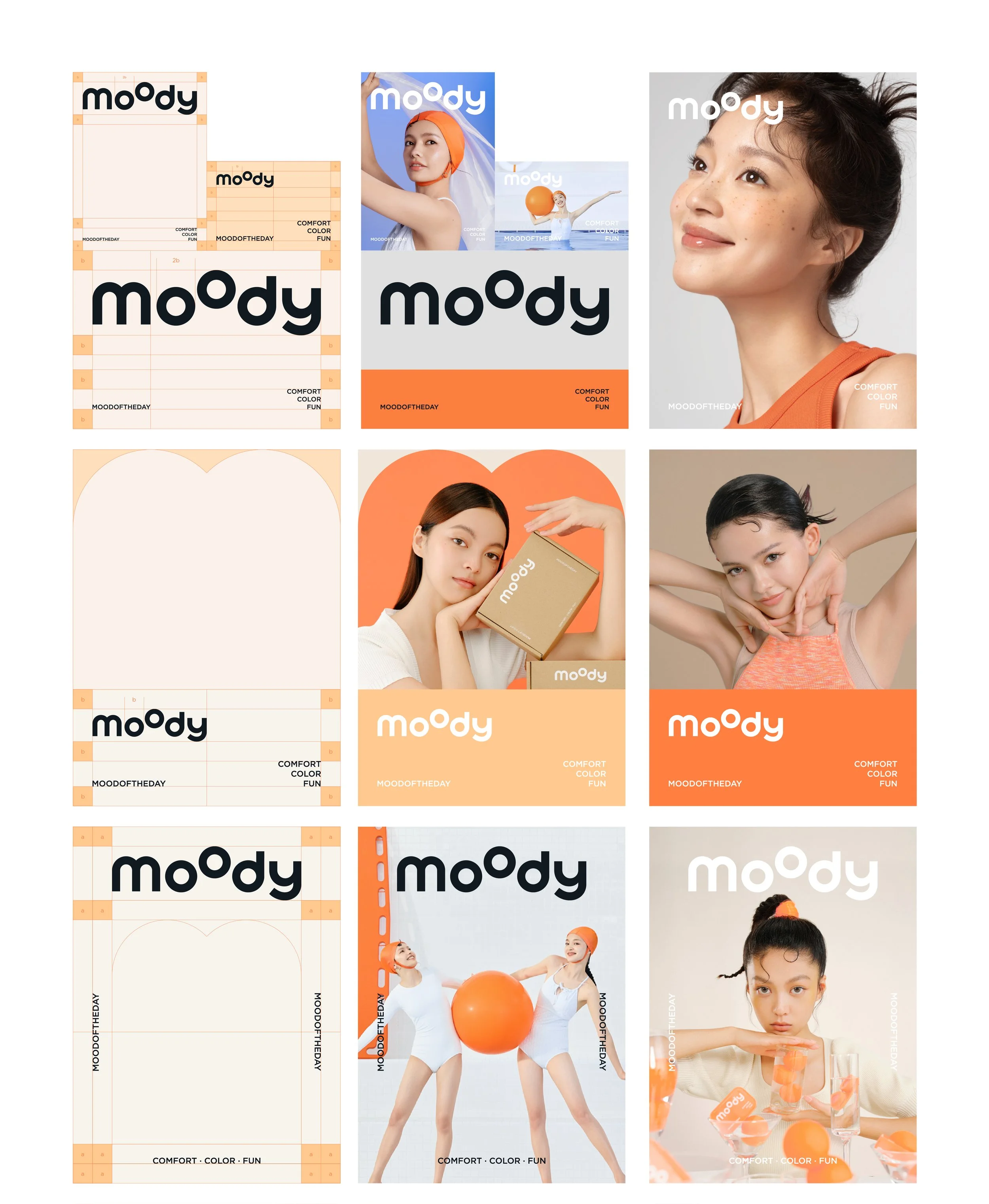
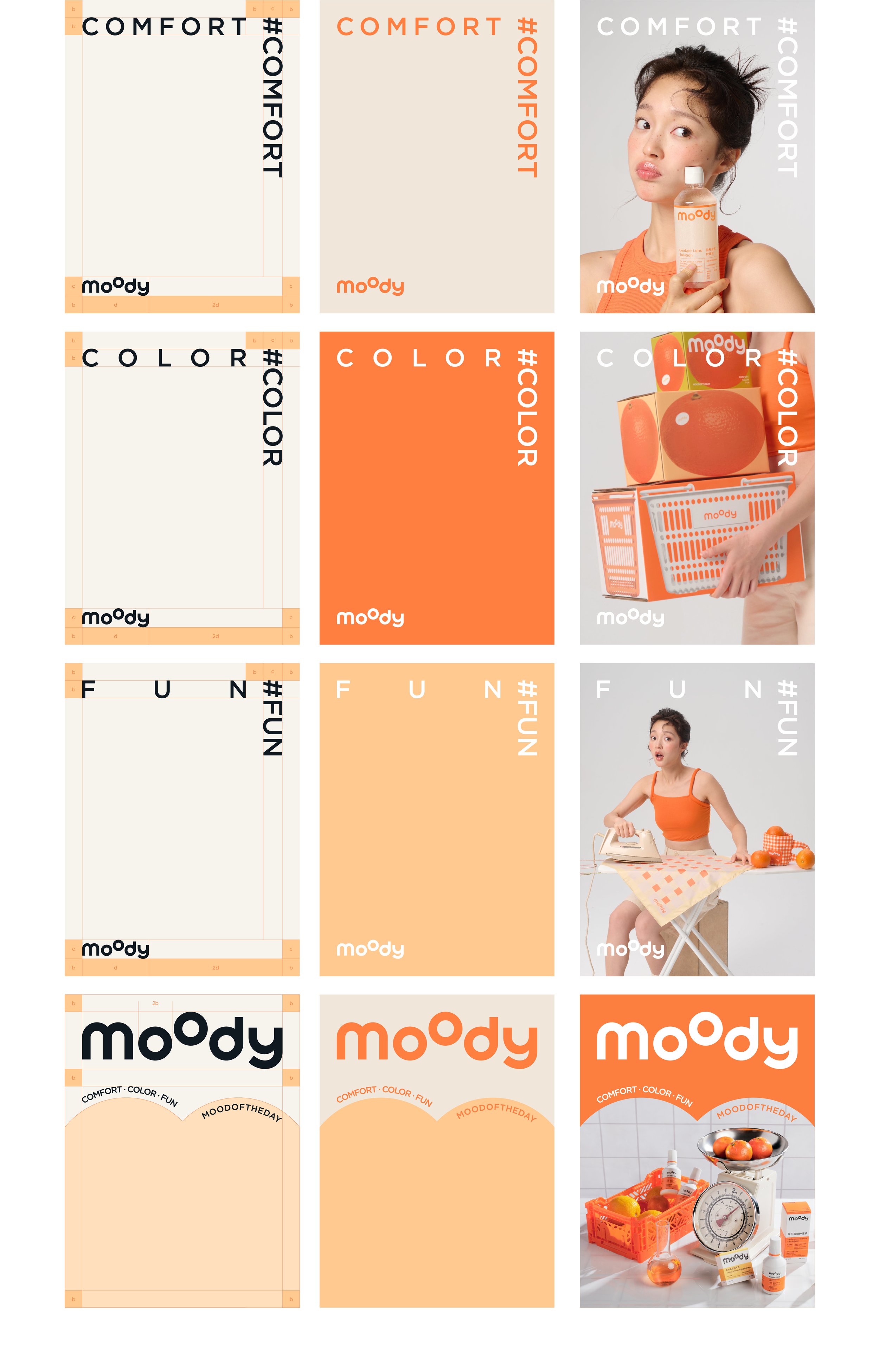
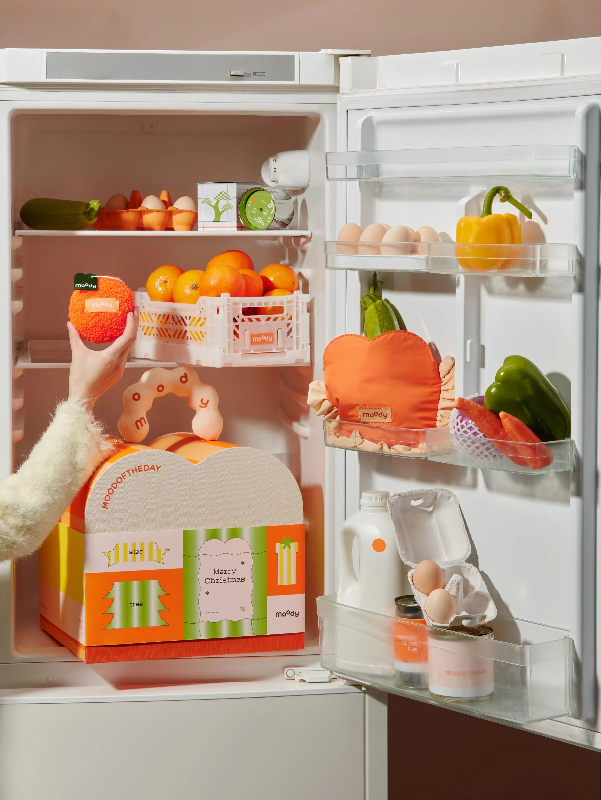
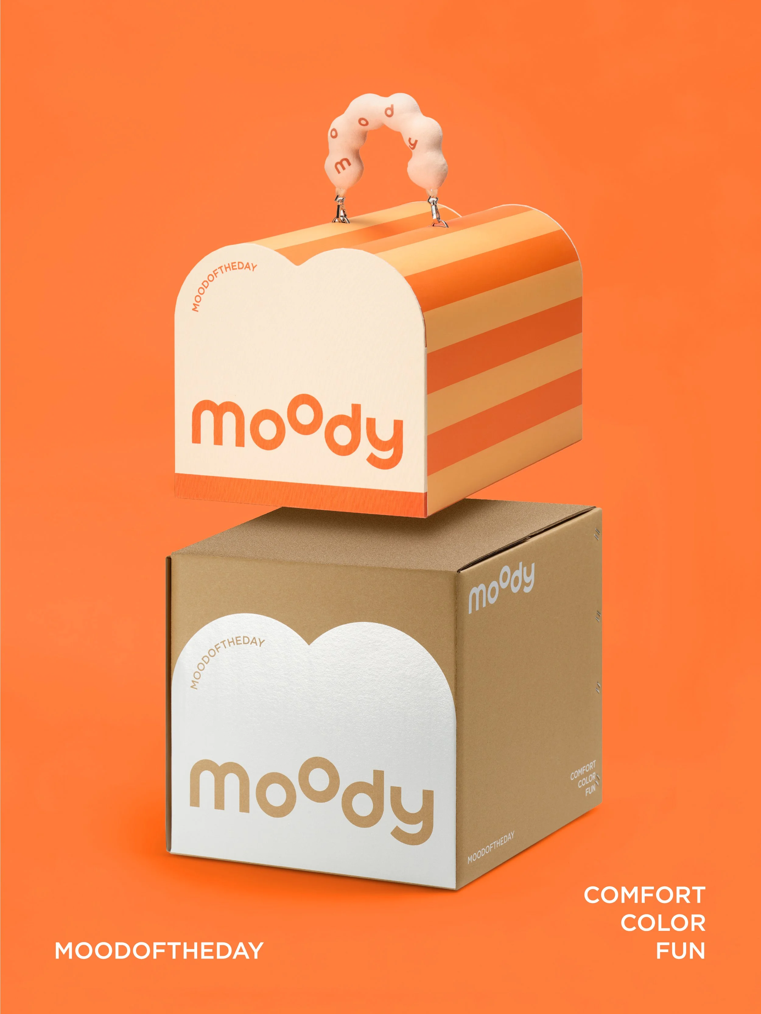
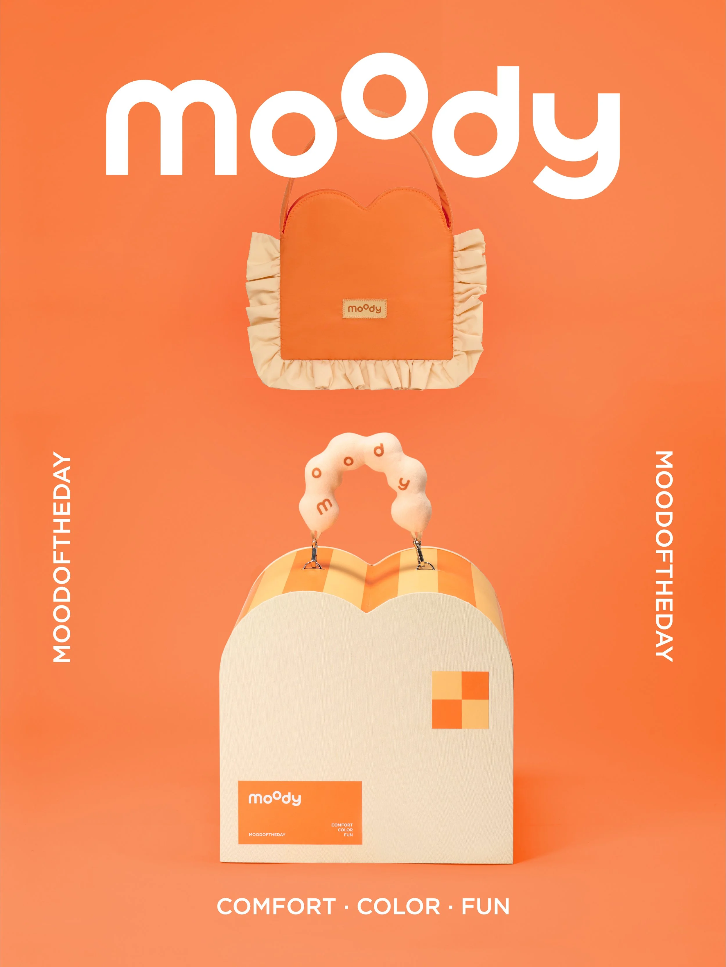
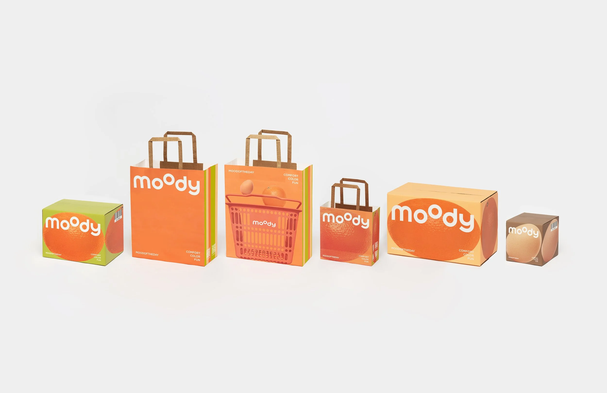
moody is deeply integrated into the fabric of daily life. Building upon the "professional, gender-neutral, and accessible" foundation of the original brand, we aim to strengthen our personalized identity through the labels of "comfort, color, and playfulness." The two dots represent the "oo" in moody and the eyes on a face. We believe that not every brand upgrade requires a total overhaul; instead, we follow the "Principle of Addition"—keeping the logo unchanged while enriching the brand’s inner soul. If moody were personified, it would be the "you and me" of everyday life—someone who seeks a touch of the extraordinary within the ordinary. This could be the choice to use colored contact lenses to accentuate facial details, a small lifestyle change that embodies our core spirit: "Everyday, but not Ordinary; Simple, but never Dull." To translate this concept into a visual identity, the primary requirement was an element that carries the brand’s signature colors and shapes while appearing frequently in daily scenes. Consequently, the orange is consistently and subtly integrated into our brand photography and products. It symbolizes both the everyday and a burst of vital energy. Oranges are ubiquitous across all seasons; when consumers see this fruit, they are reminded of moody. It is an approachable presence that represents the sense of comfort moody wishes to provide—those small, interesting, yet gentle moments in life.
moody與日常緊密結合。期盼在初代moody的"專業、中性、大眾"等品類基礎關鍵字上,強化"舒適、色彩、有趣"的個性化標籤。兩顆圓點,是moody的oo,也是臉上的雙眼。不是所有的品牌升級都需要改變,以加法原則進行品牌改造,logo不變但豐富內核。如果將moody擬人化,那他會是日常的你和我,在平凡之中想要有點不同,可以是在妝容當中選擇美瞳點綴臉部細節,是一種生活上的小改變。也是「日常不平常,平凡不平淡」的品牌核心精神由來。這樣的概念如果要賦予視覺,首要條件必須帶有品牌色彩和形狀,且時常出現在生活場景。於是品牌拍攝以及產品當中總是默默帶入橘子,它像徵日常也是一種活力能量的展現。橘子隨處可見四季皆有,消費者看到這個物件就能想到moody。是一種平易近人的存在,同時也是moody想給予消費者的舒適感,一些生活中有趣卻溫和的小事件。