2024 Advertising moody
Year Category Client
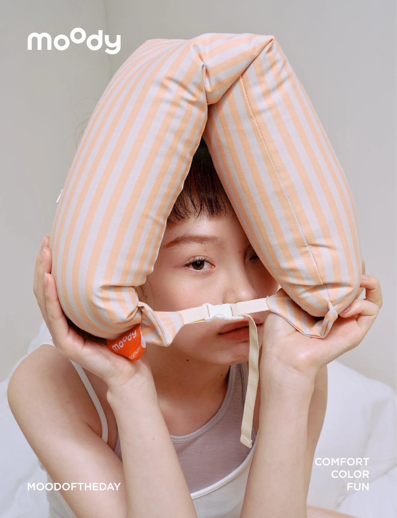
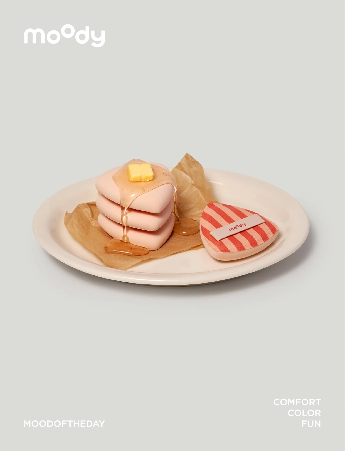
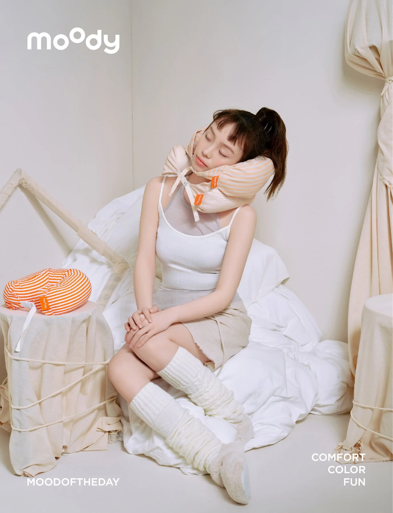
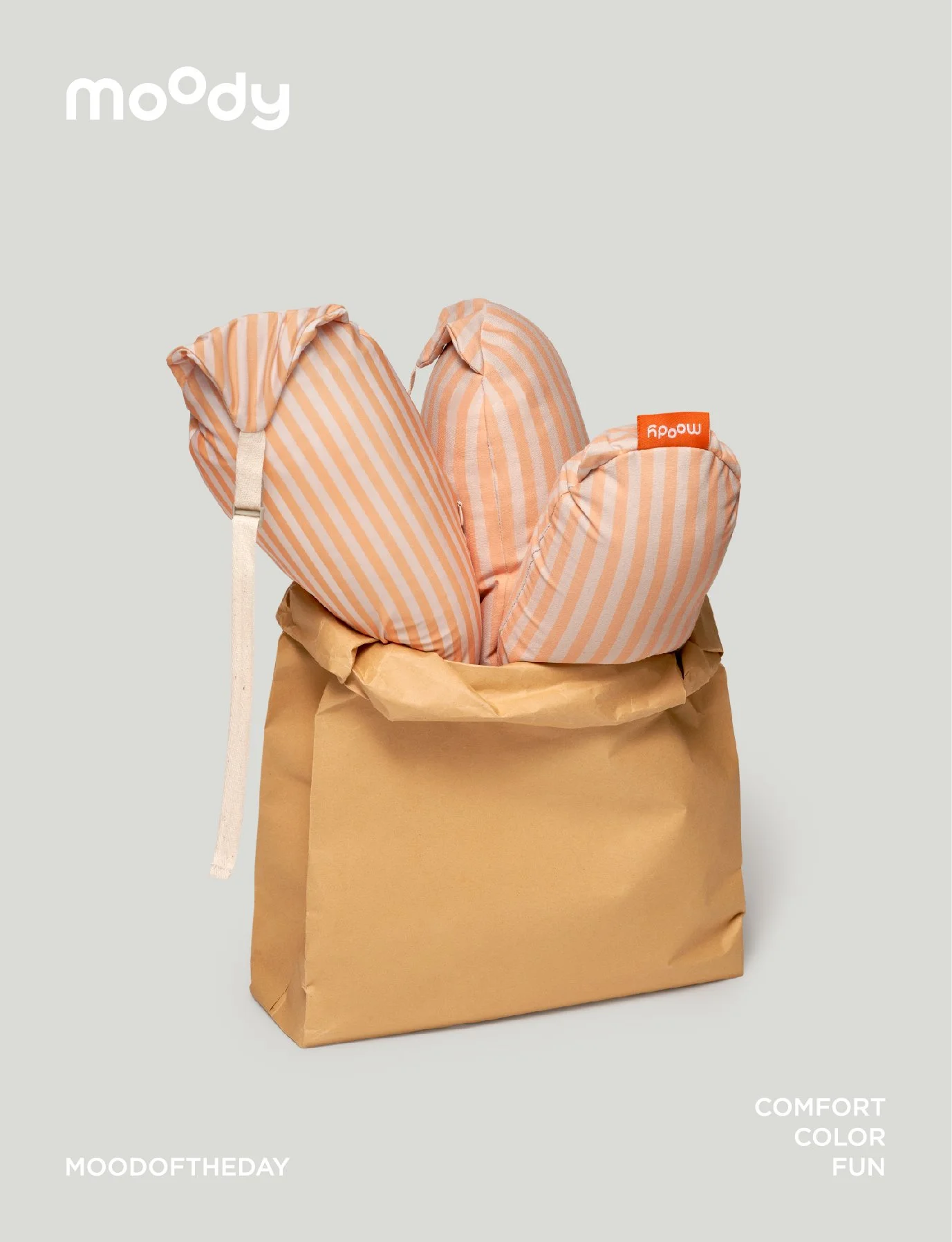
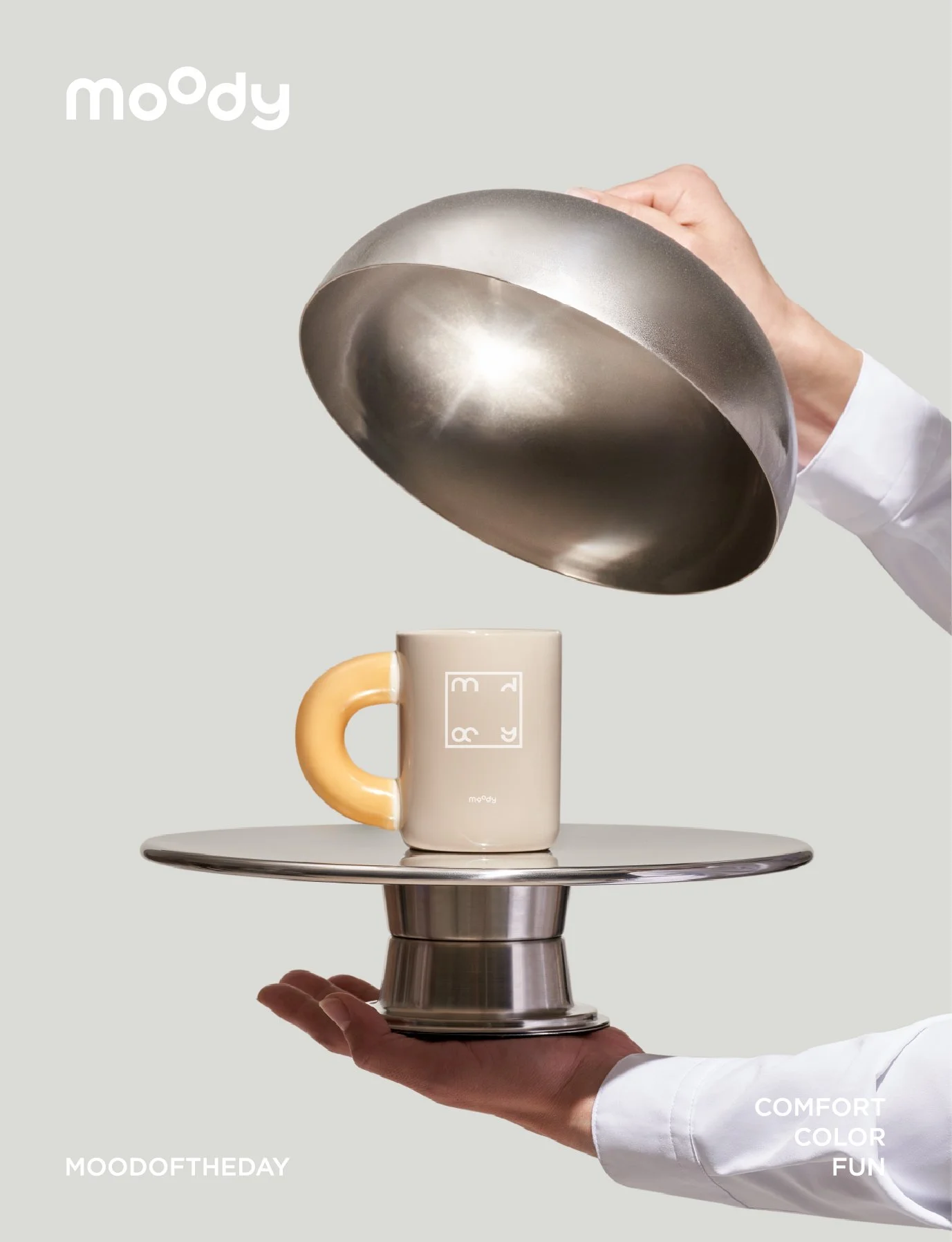
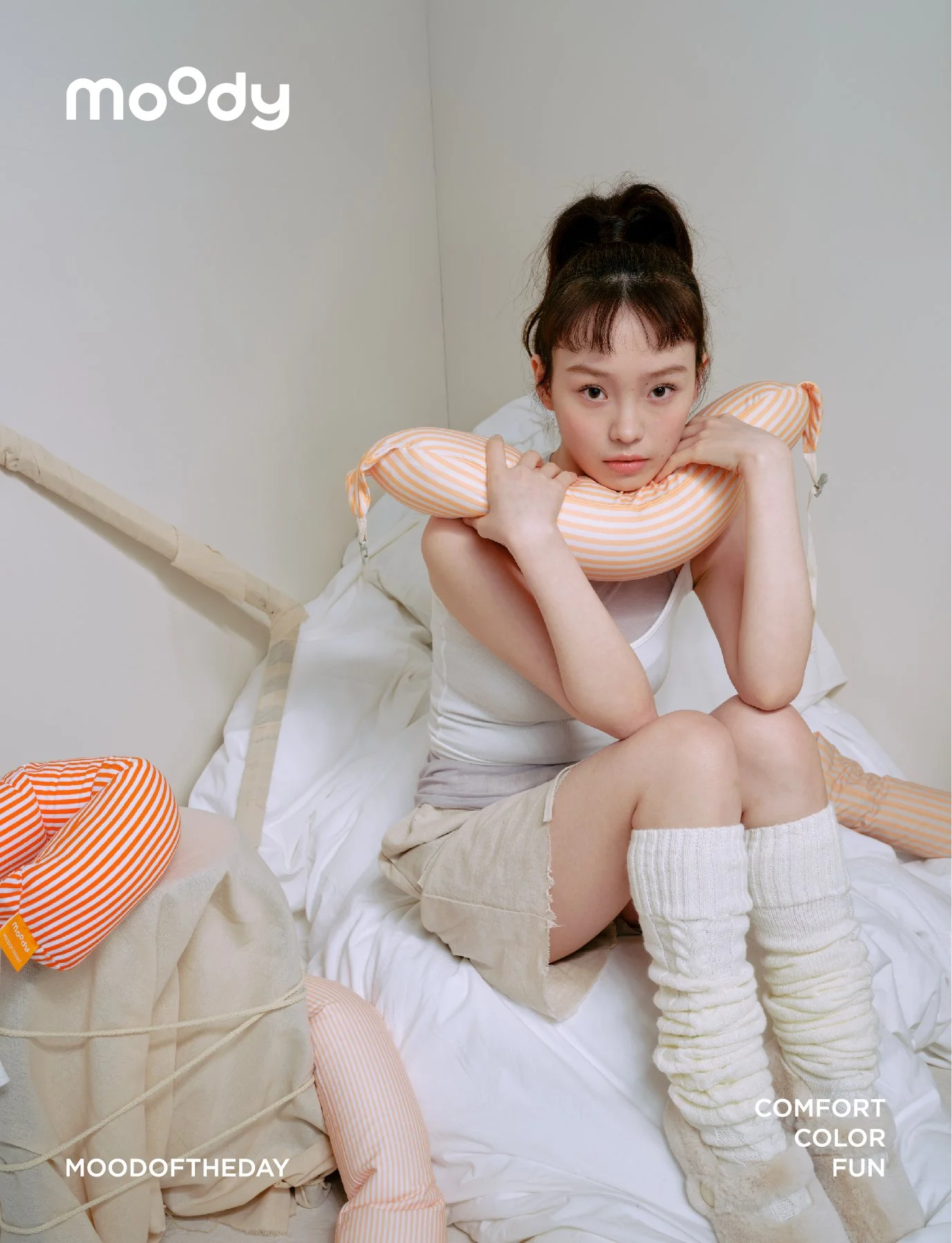
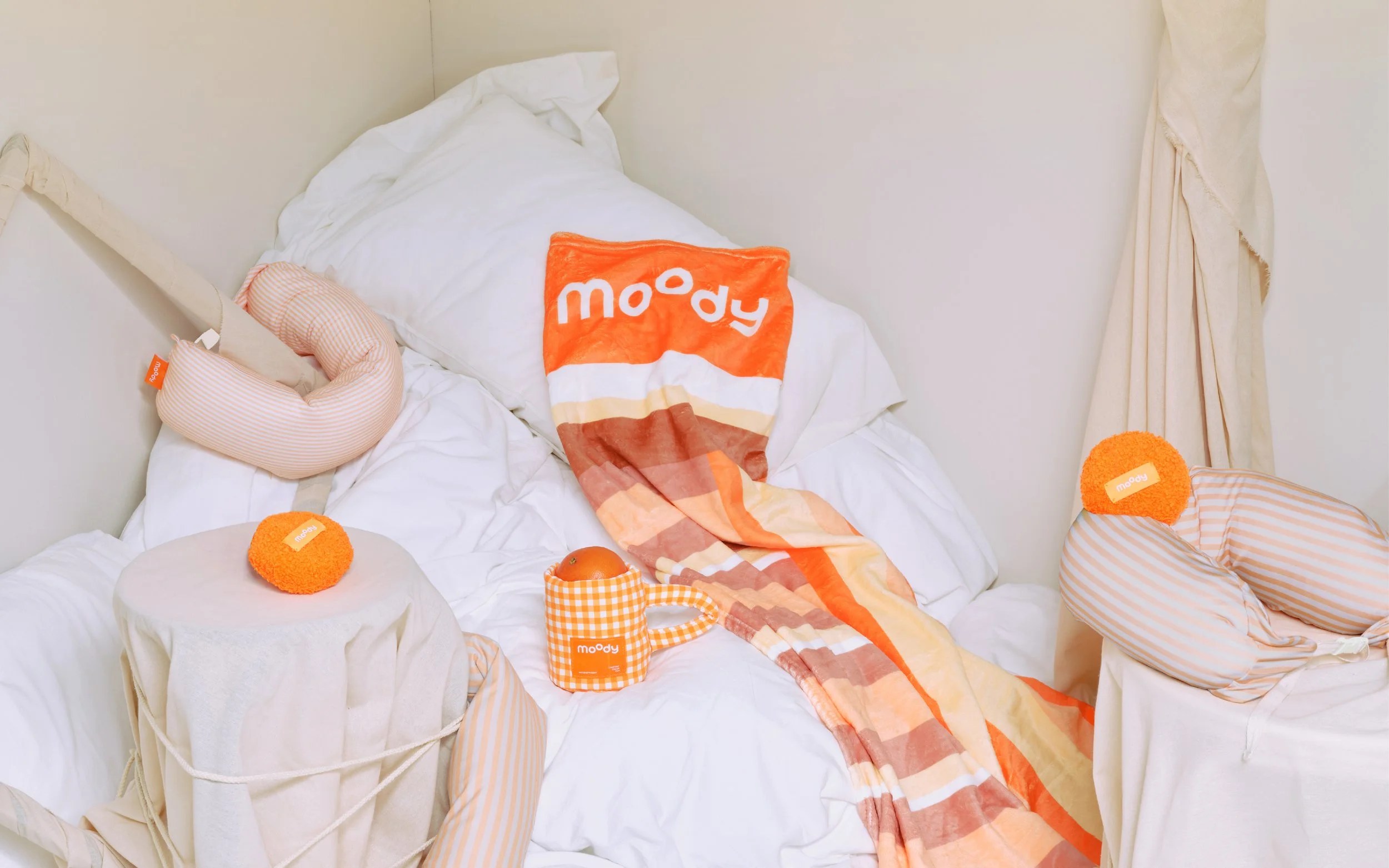
We’ve refined our iconic orange, shifting toward layered, muted hues to cultivate a lasting sense of ease. This visual reduction opens up space for the senses to breathe, allowing the brand the flexibility to evolve across diverse product lines.
適度精簡品牌標誌性的橘色,轉而引入更具層次感的低飽和色調,營造始終不變的舒適感。這不僅是視覺上的減法,更是為了留出更多感官呼吸的空間,以爲品牌延伸更多品類的可能性。