2025 Packaging Taymeet 崎寻
Year Category Client
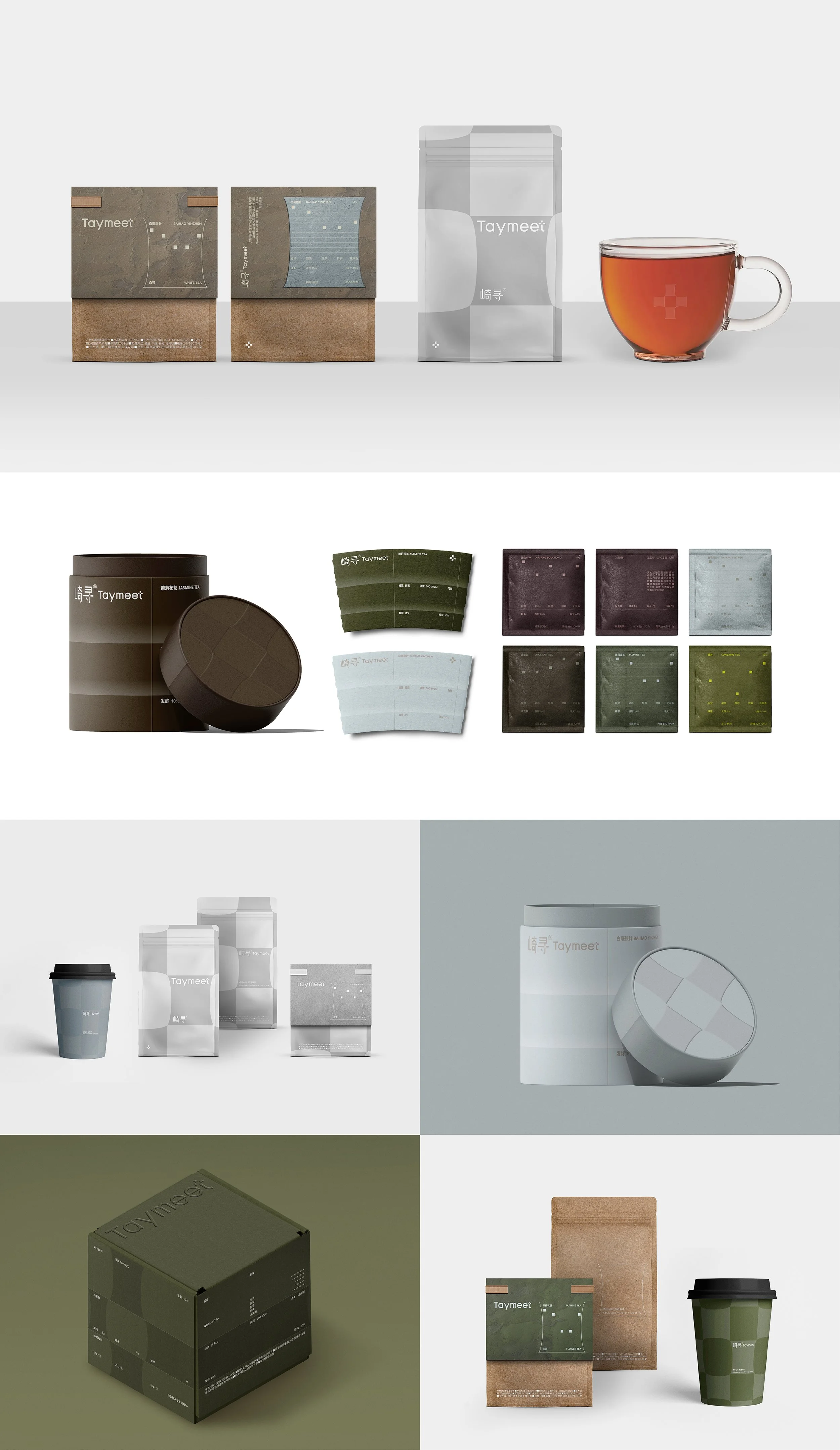
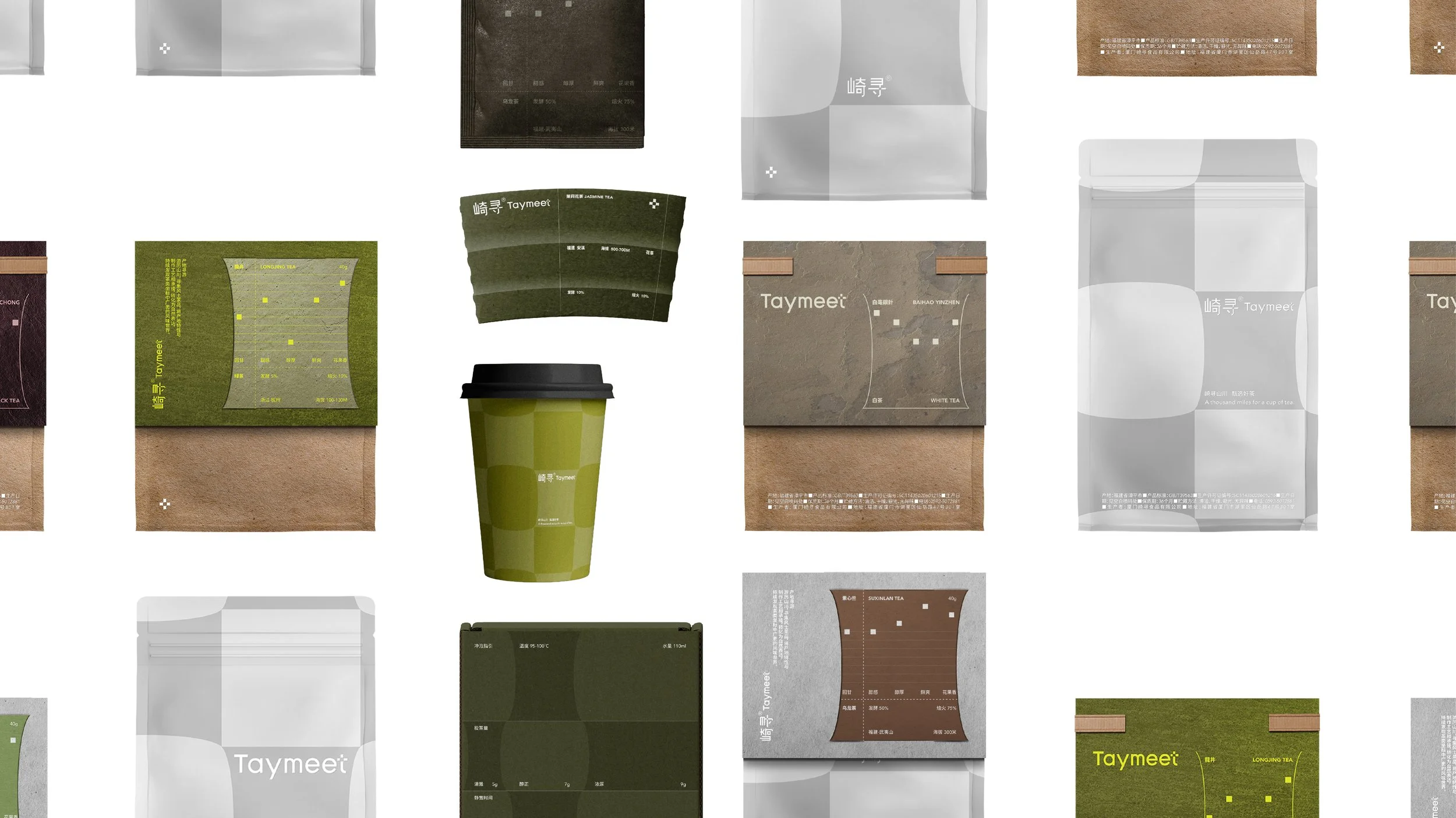
Taymeet has upgraded its packaging design. While retaining the original logo, the brand explored the scalability of the cross symbol, translating it into a signature brand pattern. Additionally, the flavor profile indicators have been reimagined as a visual representation of tea leaves falling into a cup.
崎寻包裝升級,在保留原有標誌的前提下,挖掘了十字符號的延展性,將其轉譯為品牌專屬紋樣;並將的風味指標重構為茶葉墜入杯中的視覺形象。